The Complexities of Style

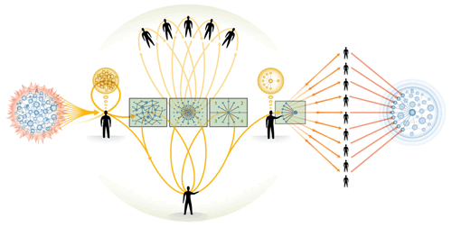
Here is another example of the stylists aesthetic of complexity–as opposed to the designer’s philosophy of simplicity (check out Stylists != Designers).

This is a gorgeous diagram, filled with nuanced shadings, a subtle and tasteful color palette (I especially like the orange and green combination), captivating visual patterns, and seductive symetries. Its also an excersize is specious visual meaninglessness and obfuscating info-decoration. What does this thing mean?!

Oh, and it has 14 different rolleover states that magnify and highlight different areas with explosions of seeming information. Information like “[t]here is a vacuum of solid evidence into which can rush our most troublesome weaknesses as human decision-makers.” Yikes. Sounds heavy. And sounds a hell of a lot more complicated than its needs to be–which is exactly what the stylist’s aethetic of complexity is all about.

This diagram illustrates a basic design process, and is perhaps the most attractive, most complicated and least intelligeble representations of a design process I’ve ever seen.

I do love the irony of the company’s tag line: “The Art of Complex Problem Solving”

Wealth Flow Key to BoP New Product Success


These ideas are still fresh (which is another way of saying that they are unfinished), so take with a grain of salt.

Apparently there’s gold rush over there in India and China. They want stuff, lots of stuff, and we only just have to sell it to them. Well not so fast there Tex. There are two factors to consider: demand, and capacity to satisfy demand (and where people have limited capacity, they must then prioritize thier demands)

Sure places like India and China are experiencing both rising demand and rising capacity to pay for their demands. However what they demand, thier capacity to satisfay demand, and how they prioritize thier demands in the face capacity limitations, are all very different from what we find here in the west. To succeed in introducing new products to bottom of the pyramid markets means understanding how approach these issues.

For instance, cell phones are an incredibly popular product in developing countries, despite the fact that their cost relative to income makes them very expensive. Certainly part of the reason is a lacking wireline communication infrastructure. But this is only helps explain demand, not either thier capacity to pay for a cell phone nore the high priority placed on cell phone ownership.

What allows people in developing countries to afford the high relative cost of a cell phone is the fact that these devices provide an actual return on investment–they make money. Cell phones do this by accelerating the flow of existing wealth within an economy.

If you have $1 it takes a year from the day you spend it for it to come back to you (you buy a loaf of bread from a baker who buys some wheat form from a farmer who buys the charcoal from you), you will not be in a hurry to spend that $1. However if it takes only a day for the $1 to come back, you won’t think twice about spending it.

Now, what makes cell phone ownership a high priority for people of limited capacity? Cell phones acclerate the flow of wealth which grows purchasing power without having to first increase the total money supply in the economy. This gets into all sorts of arcane macro economics, so lets keep this practical. Imagine you live in a part of the world where it can take weeks just to negotiate a replacement part for your broken tractor. It costs you the same price for the part, but getting it this part tomorrow means harveting your crops on time, while getting it in three weeks means getting a lower price for over ripe produce.

Accelerating the flow of wealth like this is almost like getting something for nothing: increased purchasing power with no foreign direct investment, no charity and no bloating work hours.

Toothpaste, dvd players, and even dishwashers will not have this same kind of direct and immediate effect on an economy. So while folks in bottom of the pyramid market may want such things, they can neither pay for no will they priority such purchases because these kinds of products don’t repay their investment price the way a cell phone does.

Distinguishing products this way (those that accelerate the flow of wealth vs. those that don’t) seems to provide a lot of insight into what kinds of new products will and won’t succeed in bottom of the pyramid markets. However, like i warned, this theory is still pretty fresh (it may even have to go back in the oven for a while).

Would You Like Your Brand with a Side of Spam?


The Four Seasons’s hotel chain boasts a rather luxurious brand. So why have they started serving it up with a side of spam?

Several weeks ago I sent them an email asking if there was an ATM in thier Buenos Aires hotel. Not only did it take them several weeks to get back to me, but they didn’t even answer my question–a fairly straight forward one I thought.

Now I find myself getting spamed with thier promos. They didn’t have time to answer my rather simple question, but they sure did find time to add my email address to thier spambots. Well that’s totally cheap Four Seasons. There are lots of luxury hotel chains in the world, which makes it near effortless for me to never stay at one of yours.

What’s Been Happening


The past couple of weeks have been a bit of a whirlwind. I’ve started planning a kitchen renovation, went to Buenos Aires, got caught up in a flood of business opportunities, and I’m now packing up for a trip to Delhi.

While BA was all pleasure, Delhi will be all work. My first reason to go to Dehli is to attend the Design with India conference. My second reason is a set of meetings and cultural research related to a new design and branding venture for emerging markets. This new venture is a globe spanning joint effort between me in Vancouver, Niti in San Fransisco, Manuel Toscano (you need a blog Manny!) in New York and Tasos Calantzis in Centurion South Africa.

This is exciting stuff, and not just for me either. Big changes in world are openning new doors (while also shutting others). Stay tuned!

NibTV – Geoge Carlin’s Modern Man Beat Poetry

This is pure brilliance from an underrated brilliant man. Carlin likes to hold a mirror up to our uglier sides. Here he makes a delicious beat poetry of advertising and self-delusional bullshit. I particularly love how he juxtaposes situationally contradictory words in the same phrase to show how on the one hand they are contradictory, and on the other how bullshit frighteningly reconciles all contradictions in its ultimate meaninglessness. Like I said, brilliant stuff.


See more videos on NibTV:

Adios Buenos Aires

It has been a great trip, but today is the last day. We have a few things to try to squeez into the waning hours. All in all its has been fantastic. BA is a great city, and in 2 weeks we just started to get to know her. I’ll post more when I get back. For know I need to pack.

When Style Trumps


Band & Olufsen have release a new phone called “Serene”. Too bad it looks an aweful lot like those cheap travel clocks and PIM devices you find places like the Sharper Image and airline product catalogs. Of course Serene is about $1200 more than those landfill items.

B&O’s stylistic goals are pretty clear. They wanted something new, different, novel, stylish. They wanted something people would buy that says “I’m not like you luuzers.”

What they’ve got is definitely stylish and novel. But with its cheesey flared ends, awkwardly placed keys regardless of orientation, and thumb-cramp inspiring scroll wheel, this is a phone that is stylish and novel for their own sakes. What B&O have here is the results of the stylist’s aesthetic of gratuitous complexity and disregard for design.

Check the flash video to see some of the obvious usability problems this phone offers. Notice the unnatural circular thumb movement necessary to scroll through lists. Thumb joints don’t move comfortably in the direction and orientation the phone demands. The circular motion would work with two hands (one holding and one scrolling). However people tend to operate their cellphones with only one hand. Serene forces users to either adopt a new less convenient behaviour, or get used to a cramped thumb. Thanks B&O, that’s truly innovative!

Furthermore, regardless of which way you hold it (screen on top or screen on bottom), the numbers on the dialpad are either mostly upside down or sideways. I tried to image answering an email with this keypad. It was painful, so i stopped.

When style rather than substance has been the driving force behind a product, you often don’t have much to say about it after “it looks really cool.” And so your advertising firm has to write nonsense like this: “Coherence and continuity, innovation and craftsmanship.” Coherence and continuity?? Sure these words make a pleasing staccato alliteration, but what do they mean in the context of a cell phone? Nothing, absolutely nothing, that’s what.

And this one really cracks me up: “Serene will astound with its good ideas and common sense solutions.” I would definitely be astounded if my cell phone started spouting off good ideas and common sense solution. “Pssst, John, we should go have some Pistachio gelato.” “Good idea Serene! Let’s go!”

Simple is Expensive

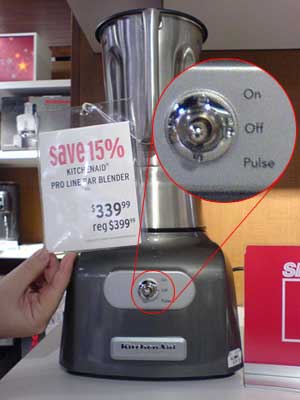
It looks like if you want simple, its going to cost you. KitchenAid has a new blender out that’s super simple. On this unit you will only find only one retro style switch that offers three choices: up for on, down for pulse and center for off. And that’s it.

What will this kind of simplicity cost you? Well about $400 regularly. That about 6 times more that your average blender with lots of buttons.

Apparently its very expensive to strip out functionality.

BaseCamp Reality

Hype bothers me. Bullshit bothers me. Self promotion bothers me, especially when its made of equal parts hype and bullshit. As an example I’m going to pick on 37 Signals’ Basecamp product. Afterall, they’re certainly big enough not to care about what I say, and since every action has an equal and opposite reaction, it about time for some opposite reactions–otherwise known as reality.

Here’s the reality: Basecamp and 37 Signals’ other poroducts are not nearly a great a they lead everyone to belive. For all the hot air they spout about usability, design and general philosophy of being (more Deepak Chopra then actual ontological enlightenment), i have to ask where’s the beef?

Here are just a few choice examples of many:

How does one edit Company profiles? Its far from clear. I know I did it once, but I can’t seem to figure it how to do it again because the UI is so often completely opaque.

Conceptually Wrtieboards are integral to a project, functionally they are jarringly separate. So much for user-centered design.

From an individual writeboard you can’t get back to the project by clicking the project name–that only bring you back to the main list of writeboards, not your project. Elsewhere in the app project names link to the project’s overview page. Why a unique behaviour here?

Where can I keep a list of links relevant to the project and team? in a message? but the gets burried under chronology. A writeboard? That’s neither obvious, nor easily accessed. Sure you can store your extra bedsheets in the oven, but that’s not really thier proper place. Information simiarly needs a proper place.

Campfire is also poorly integrated with Basecamp despite users’ conceptual model of the chat session belonging to a project.

Staying with Campfire, the window size is enormous. Chatting is often a periphal activity, but the Campfire window size demands huge realestate. Its easier to just use Google Talk (equally simply visual design but with a flexble size).

Filename links in project messages bring you to a list of files, not the file you actually clicked on. This subverts natural expectation

Basecamp/Campfire chewed up 2gigs of RAM after being left open for a day and a half. This problem only seemed to occur with IE, but that’s irrelevant. Who ever heard of a memory leak from a webpage??

And here’s the real kicker–a year of Basecamp (never mind Campfire) with a secure erver (if you’re working for a clinet, they’re going to want at least that much security for sensitive PM info) is over $600. That’s right folks, the cost of Baecamp is like buying a new version of Microsoft Office Professional every year.

Here are a couple alternatives:

1. Use ActiveCollab, it a free, open source project management tool like Basecamp you can install on your server in like 3 minutes.

OR

2. Create a WordPress blog for each project. This gives you almost as much power, much more flexibility, and all for no cost.

Don’t belive the hype folks, my experience with Basecamp has shown me that its frustrations outweigh its benefits, that it cost is utterly unreasonable, and that there are other better alternatives available.