|
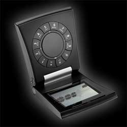
Band & Olufsen have release a new phone called “Serene”. Too bad it looks an aweful lot like those cheap travel clocks and PIM devices you find places like the Sharper Image and airline product catalogs. Of course Serene is about $1200 more than those landfill items.
B&O’s stylistic goals are pretty clear. They wanted something new, different, novel, stylish. They wanted something people would buy that says “I’m not like you luuzers.”
What they’ve got is definitely stylish and novel. But with its cheesey flared ends, awkwardly placed keys regardless of orientation, and thumb-cramp inspiring scroll wheel, this is a phone that is stylish and novel for their own sakes. What B&O have here is the results of the stylist’s aesthetic of gratuitous complexity and disregard for design.
Check the flash video to see some of the obvious usability problems this phone offers. Notice the unnatural circular thumb movement necessary to scroll through lists. Thumb joints don’t move comfortably in the direction and orientation the phone demands. The circular motion would work with two hands (one holding and one scrolling). However people tend to operate their cellphones with only one hand. Serene forces users to either adopt a new less convenient behaviour, or get used to a cramped thumb. Thanks B&O, that’s truly innovative!
Furthermore, regardless of which way you hold it (screen on top or screen on bottom), the numbers on the dialpad are either mostly upside down or sideways. I tried to image answering an email with this keypad. It was painful, so i stopped.
When style rather than substance has been the driving force behind a product, you often don’t have much to say about it after “it looks really cool.” And so your advertising firm has to write nonsense like this: “Coherence and continuity, innovation and craftsmanship.” Coherence and continuity?? Sure these words make a pleasing staccato alliteration, but what do they mean in the context of a cell phone? Nothing, absolutely nothing, that’s what.
And this one really cracks me up: “Serene will astound with its good ideas and common sense solutions.” I would definitely be astounded if my cell phone started spouting off good ideas and common sense solution. “Pssst, John, we should go have some Pistachio gelato.” “Good idea Serene! Let’s go!”
Agree with you mate; it’s an underconsidered and overworked turd of a phone. It’s only reason for existence is… hang on there is no reason!
Ha ha! “turd of a phone”!
“Too bad it looks an aweful lot like those cheap travel clocks”
could not have said it better myself, the question then becomes: why do you think they actually produced this piece of… phone? lack of touch with customers? lack of testing? lack of managers willing to call bullshit when they see it?
They’re Bang & Olufson, purveyors of fine European styling and design for decades. This is their exemplar of that approach to product design for the consumer, a finished masterpiece as conceived by a designer, as work of art, not a functional utility piece. So.